
“Hey Mercedes” Speech UI System
The Product
The next generation“Hey Mercedes” speech, leveraging Liquid AI model, is able to handle more complex conversations and vehicle feature requests. This calls the need to display conversation UI accordingly. The visualization not only solve many legacy problems, but also provides ways to collect user feedback which helps further personalize their in-car experience.
Team me (Product Design) + Fabian (Advanced Concept), Conner Ward (Prototyping Engineer), Andrea Kao (UX Research)
Skills UX Strategy, Research, Ideation, Wireframe, UI, Design Scope & PM Duration 4 months, ongoing
Context
New Technology Solving Legacy Problems
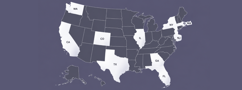
Visualize Customer Input
The 10 top-selling states for Mercedes in the U.S. happen to be the 10 most linguistically diverse states. Currently, without ASR transcript visualization, consumers are unable to verify whether the vehicle correctly recognizes commands spoken with different accents.
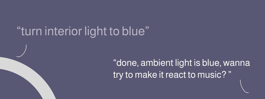
Search and Suggest
Customers often do not know the exact feature names or where to configure them, even for common features like “running boards” and “ambient lighting.” LLMs can not only identify the correct feature from ambiguous descriptions, but also suggest customization options and surface related features.
Process
First, laying out (the max) foundation
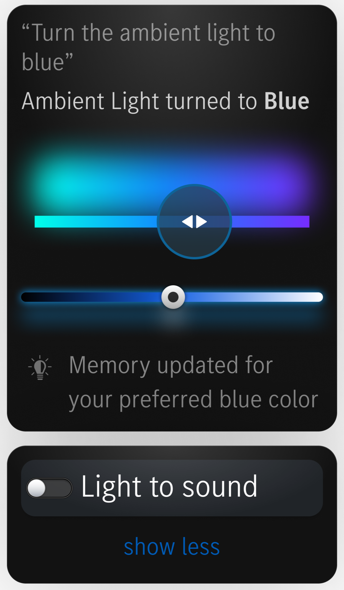
We started with a widget system and included everything we wanted to solve, with the intent for the structure to be adapted to users’ preferences over time or from direct user command to hide/show the section. The elements later got categories into 3 rows:
Row 1
Transcribing user intents
Row 2
Generating interactive UI elements for quick customization and preference learning
Row 3
Suggesting relevant features for further discoverability
Then, deciding what topics to prioritize
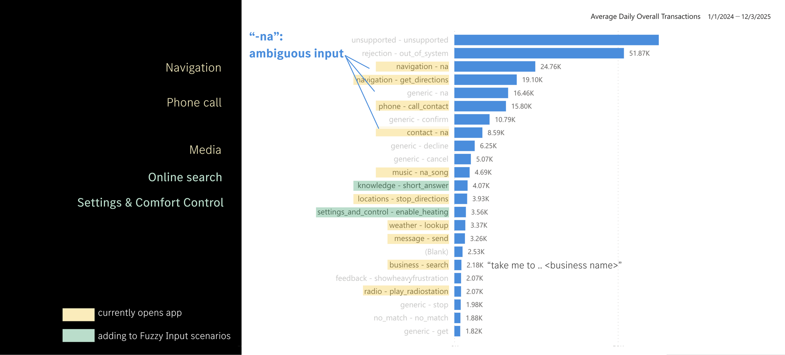
In a perfect world we’d launch this for all vehicle speech features at once; however, to be realistic we reviewed current speech use cases and their intended business value and then selected the use cases to focus on for the first batch.
but not all elements are equally useful for different tasks, and even for the same task, people’s preferences are probably different
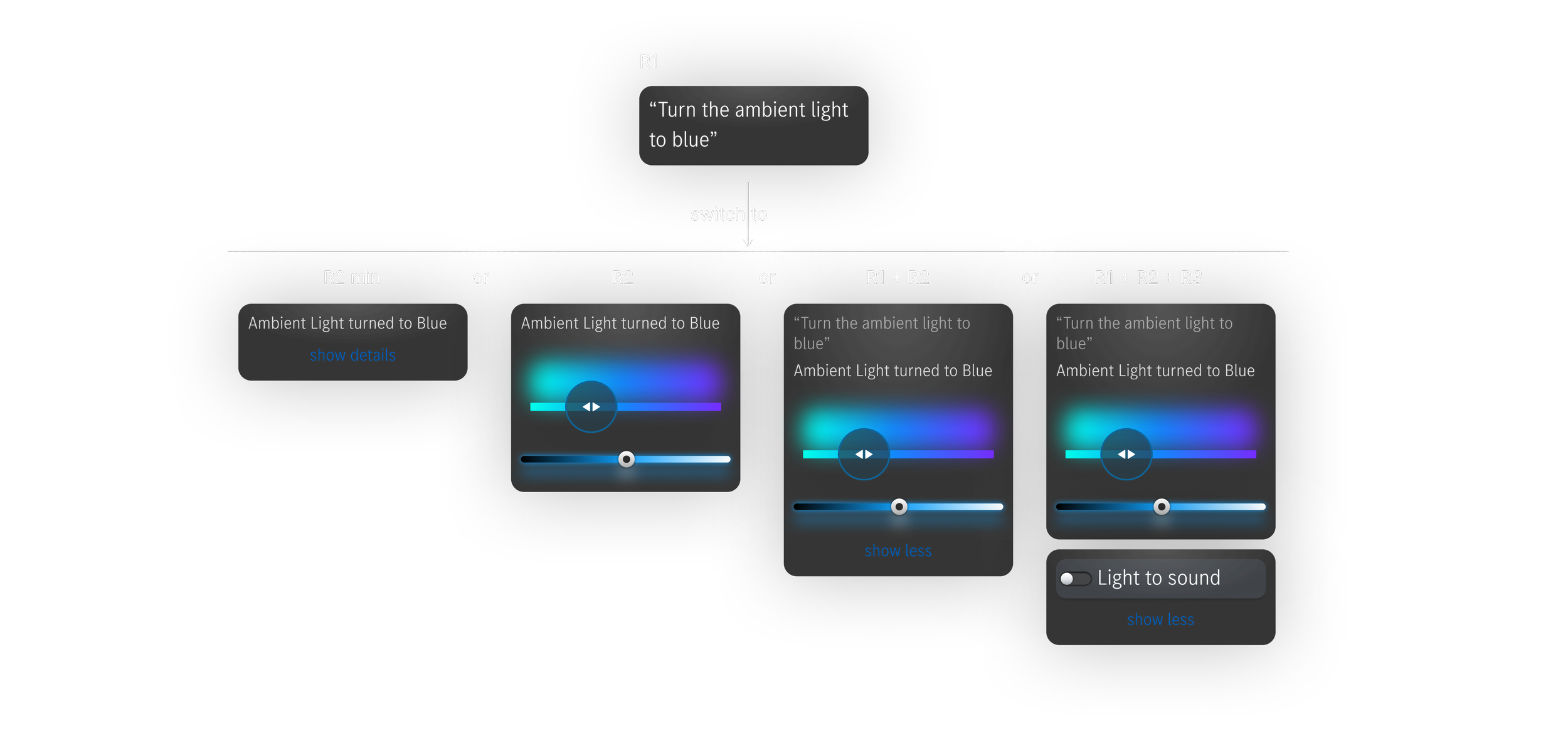
Throughout ideation we found even for the prioritized use cases, not all of them need the same amount of visual indication, i.e. Row 1, 2, 3 don’t need to all shown by default in all scenarios, but how exactly should it be different?
Answered by User Research
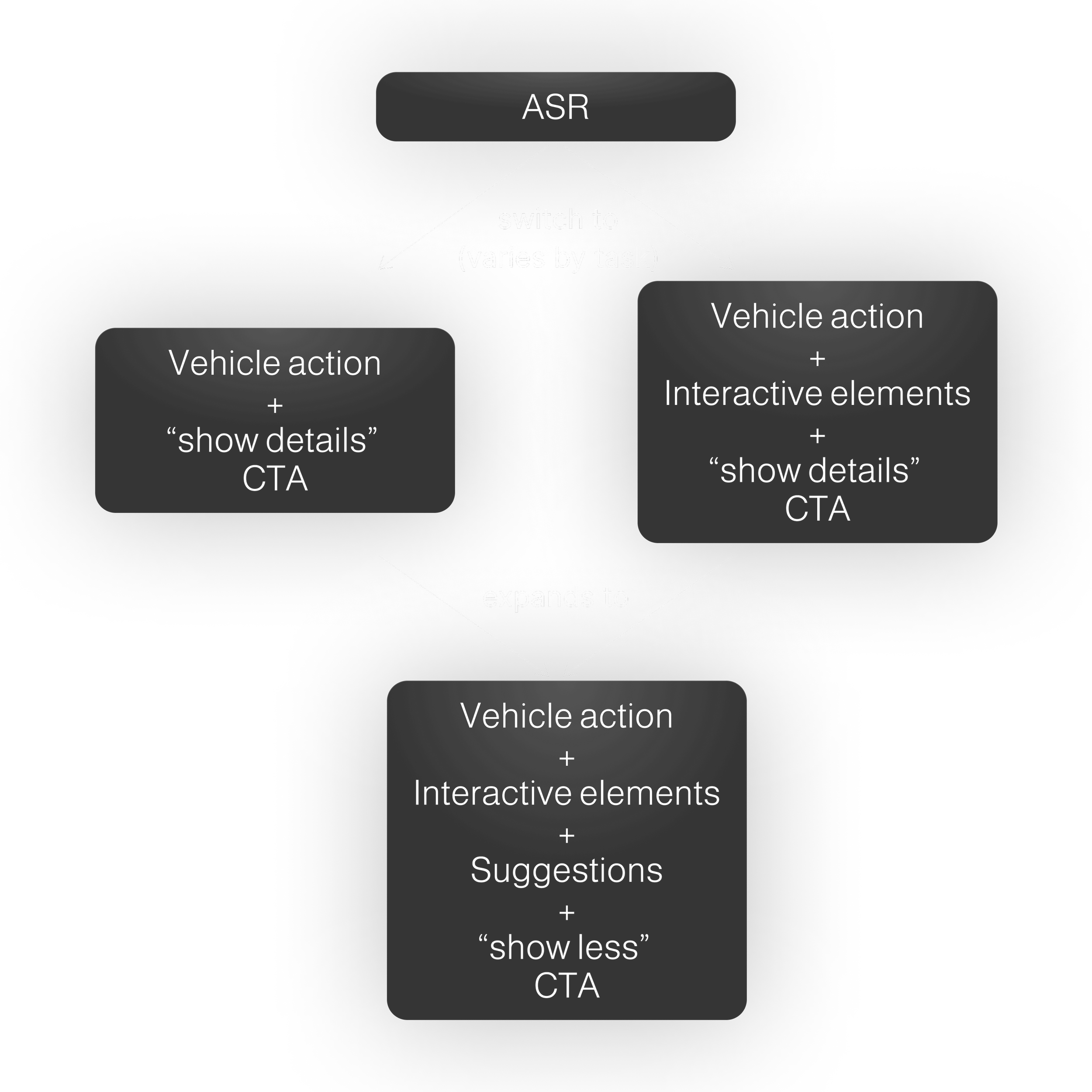
The user study conducted confirmed this hypothesis, and to be specific:
Small widgets with an expand option were most preferred. For straightforward requests, users prefer fewer interactive components.
Suggestions (R3) are more accepted when the tasks are more ambiguous and complex.
This helps us decide the default format for new buyer before the vehicle is able to pick up drivers’ interaction patterns with the widgets.
other findings
Overall, widgets are mainly valued for quick access to hidden functions. Flexibility to easily change their request is also highly appreciated.
“Memory” feature was favored for recuring preferences.
Hello, World!
MVP