24PetWatch.com Redesign
optimized insurance purchase flow for higher conversion rate

Skills Content Blocking, Ideation, Wireframe Duration 3 months
Team me + David Han (UX Oversight), Matt Medley (Art Director) & Ani Artinian (Copy Writer)
Challenge & objective
Research conducted shows that the current website has a low conversion rate and high bounce rate for returning users. Meanwhile, the call center has been overwhelmed with a huge volume of phone calls for the purchase, which can be alternatively completed online.
Therefore, the objective of the project was to increase the online conversion rate with a smooth experience while resolving potential customers' concerns proactively.
What did client know about their customers?

Returning visitors (16% of all visitors) have a bounce rate of 54%, compared to 46% for new visitors. This indicates that the information on the website is insufficient to encourage them to make a purchase upon their return to the site.
Opportunity
Content that can potentially serve as a decision-making factor, such as competitive comparisons, reasons to buy, available offers, etc.

Mobile sessions represent 53% compared to 41% on desktop. However, the conversion rate is lower on mobile at 0.31% versus 1.02% on desktop, indicating that users tend to research on mobile but complete transactions on desktop.
Opportunity
Boost up conversion rate on mobile with responsive checkout flow design
Talking to more people
There was no budget for further research, but I casually interviewed several friends and families who are pet owners.
Confusing Product Information
Some potential customers find the product information confusing and hard to understand due to varying levels of knowledge.
Don't See Value
Since pet insurance is not legally required, potential customers hesitate to purchase intangible coverage for unlikely incidents.
Opportunity
Clearly list product features and benefits with concise descriptions for easy comparison and decision-making.
Final product
Dog insurance landing page updates
Added description copy in each plan, which helps customers differentiate the plans and make faster decisions with confidence.
Added a tooltip which explains the terms ‘Deductible and Co-Insurance’ for first-time insurance purchasers.
Visually separated the wellness module as an optional add-on product with clear indication of its additional cost.
Divided coverages into 2 sections (illness and accidents) with icons and checklists for easy digestion.

Added ‘how-to-claim’ module to highlight the simple claiming process.
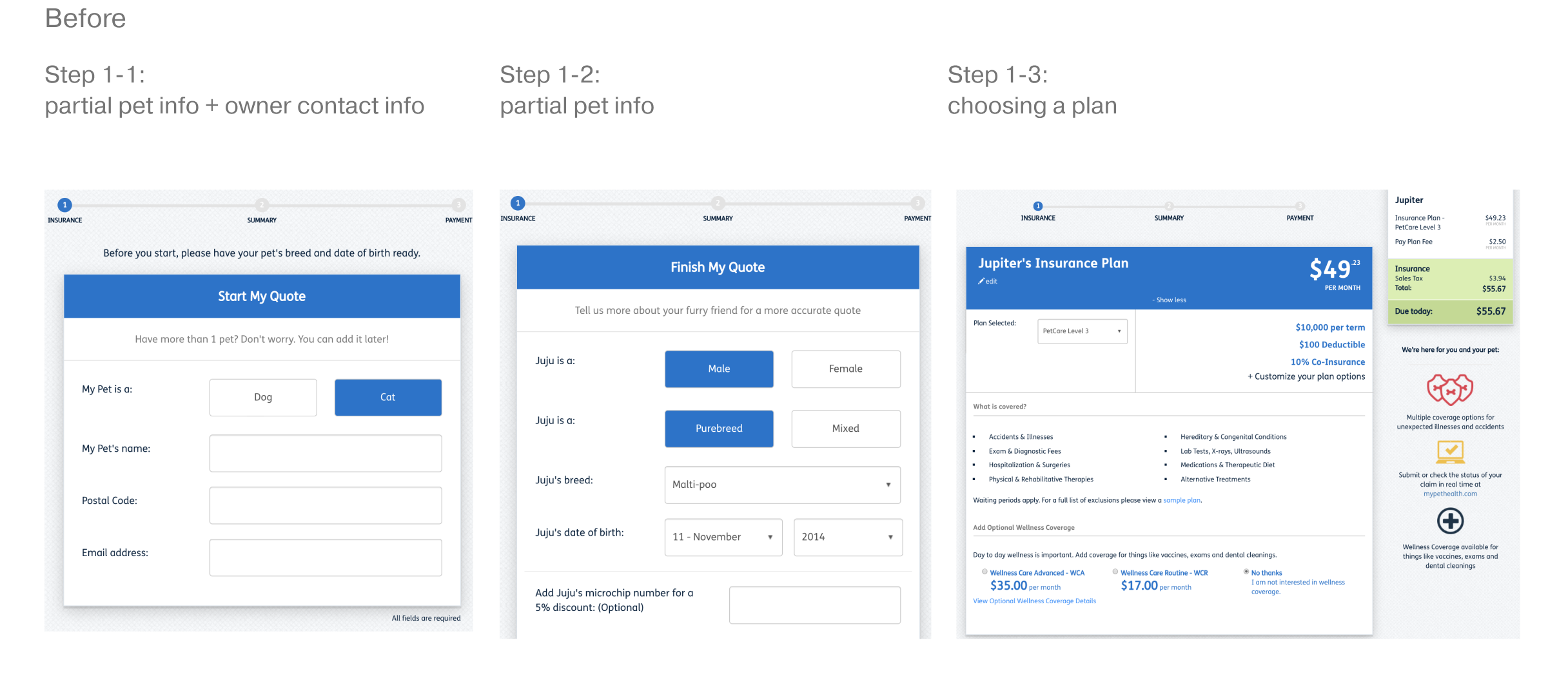
Insurance checkout step 1
In the previous version, Step 1 consisted of three mini steps ('Start your quote', 'Finish your quote', and 'Your pet's plan'). This caused confusion as users would still be on the same step after completing three pages of the form. To address this, I restructured the steps so that the new Step 1 encompasses form fields for gathering all the necessary information about the pet and owner.
Added coverage/benefits in the supporting area as a reminder of the value people are getting from the product.

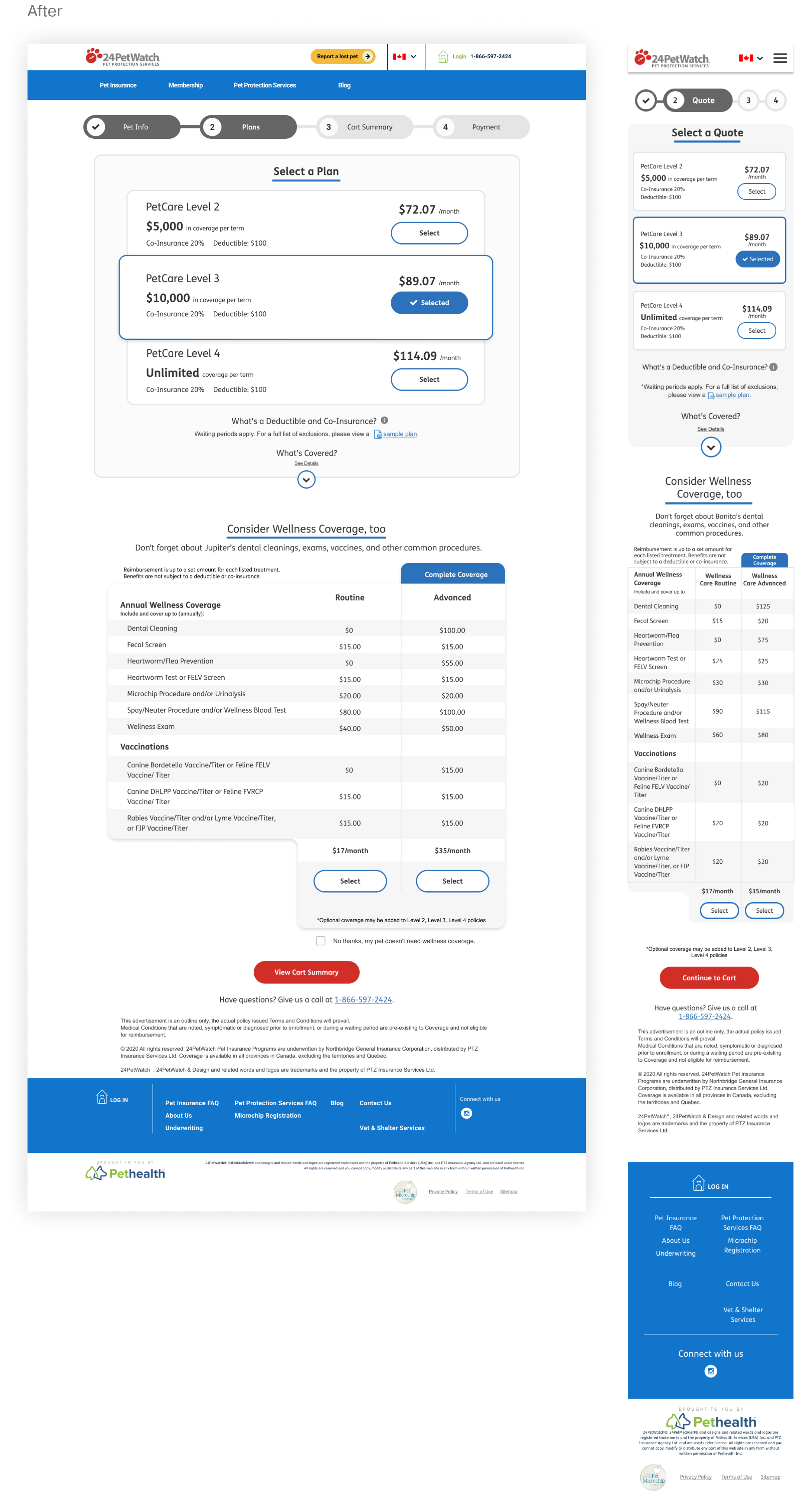
Insurance checkout step 2
In the previous version, the available plans were hidden in a dropdown list, limiting users to view details for only one plan at a time and making product comparison difficult.
In the new version, all plans are displayed in cards, allowing for easy comparison.
In the previous version, the 'customize your plan' option would appear even when the plan was not customizable.
In the new version, if there is only one deductible option, the customization functionality will not be displayed to prevent disappointment and confusion.
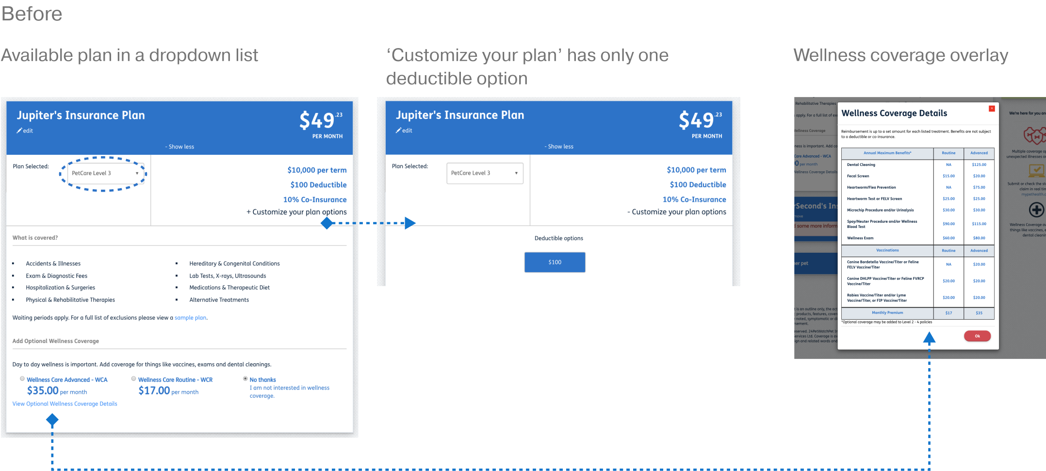
In the previous version, the 'Wellness coverage details' button was easily missed at the bottom of the page.
In the new version, we made the reimbursement items list visible to showcase the product's value upfront and boost conversion rate for wellness coverage.
Other updated key pages

Learnings
Pain point resolution is key.
Insurance is a highly product-based industry where customers can easily switch to competitors for better plans at lower prices. With low loyalty associated, resolving the pain points is crucial for a product to stand out.
Take an extra step to investigate.
The client was not able to connect us with any insurance product specialist, so the only way to understand the products and user flow is to dial the call center as a potential customer. From the phone calls, so much unexpected information was revealed, which explained why customers also relied on the call center.
Design in context, the web experience of purchasing is only a part of the journey.
Users should have clear ownership of their data and have the right to access, modify, and delete their data. The app should have transparent data management policies and procedures to ensure that user data is handled appropriately.